eCommerce Site for Training Organization
Overview
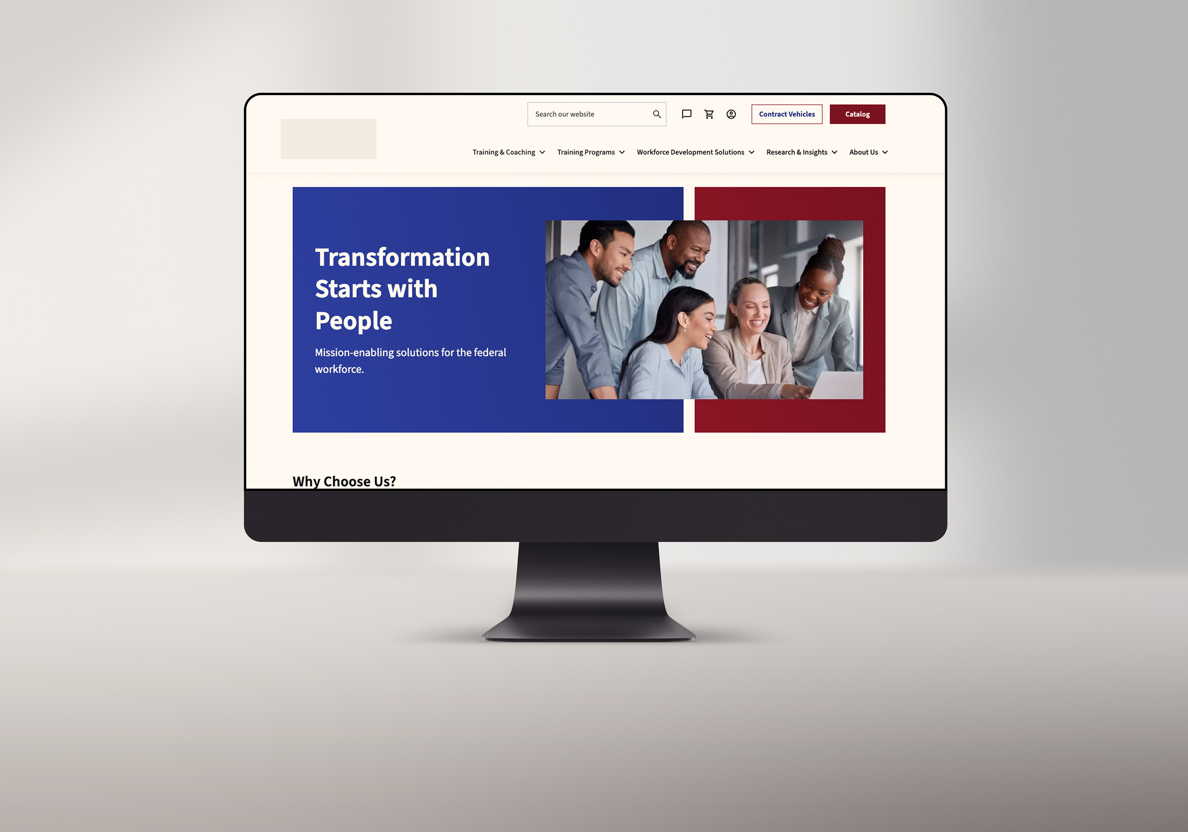
A training organization that needed to improve the user experience on their website by creating clear paths to purchase, intuitive navigation, and a comprehensive homepage view. Through the use of the design thinking process, we were able to understand users' needs to create a solution that met business requirements and worked within the technical constraints. Overall usability testing with users showed that we improved the usability of the site and created a comprehensive homepage view.
Problem Statement
The company website is not meeting user expectations and business goals. Leading to poor conversion rates, high cart abandonment, and users relying on email to make purchases.
UX Process
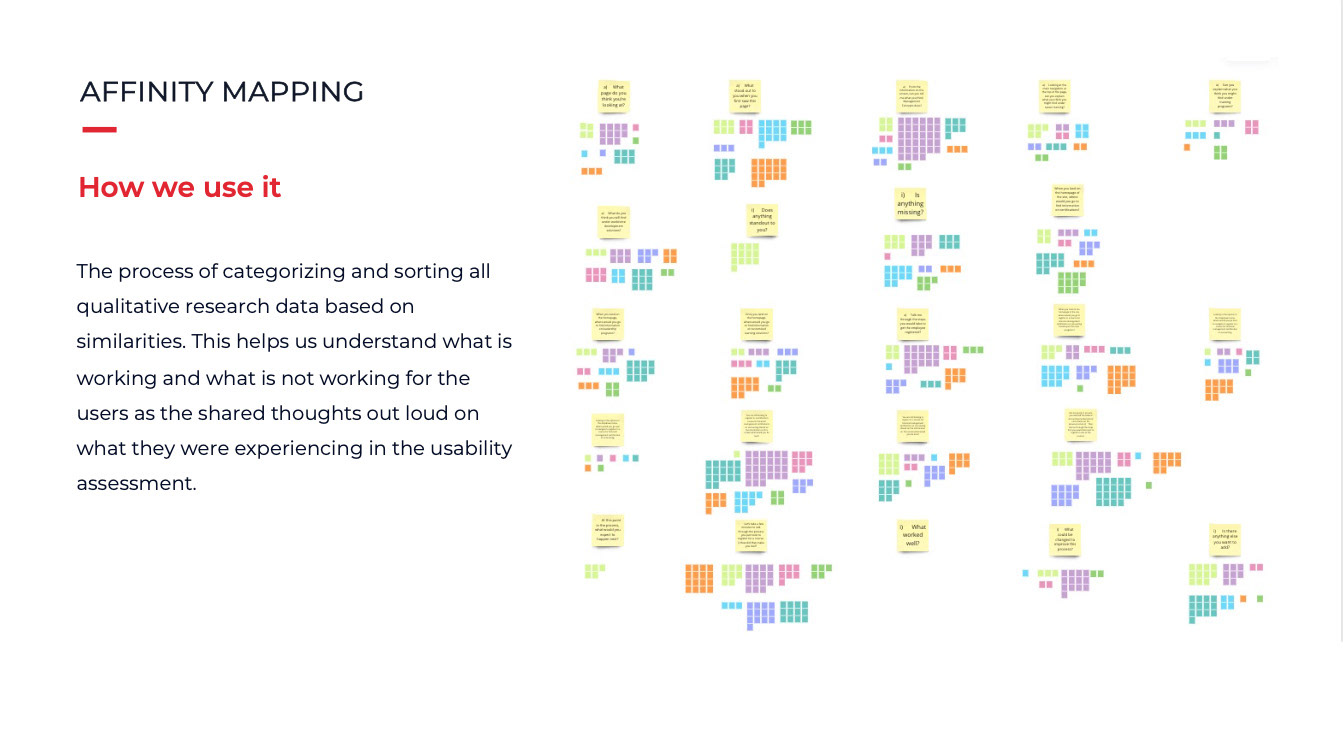
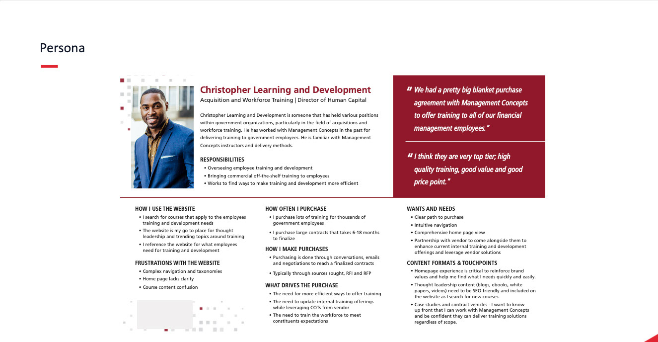
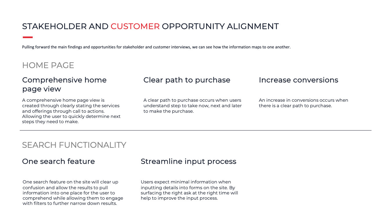
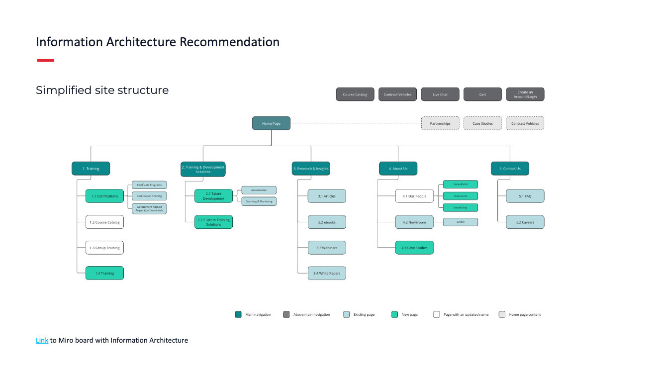
This engagement was broken down into phases of work. The first phase was the discovery phase. In this phase, I conducted stakeholder interviews, and user interviews, identified and created a new persona, captured several current state customer journey maps, and proposed a new information architecture for the site. This worked laid the foundation for the next phase, design.

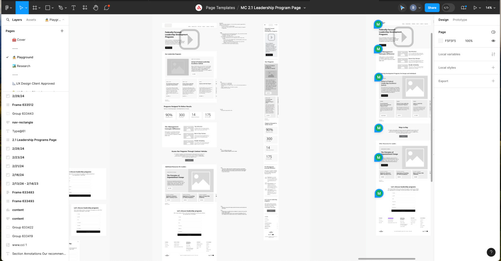
In the second phase of work, design, we created 30 wireframes. Working within the constraints of WordPress we met with the development team to determine what pages would be created as templates, page builders, or post types. We also worked on creating a limited amount of blocks or components for reuse within the page builder pages of the website. This was a bit of work at the start of the design phase but paid off in spades as we continued to create wireframes by using the component library saving us time.
Each wireframe was put in front of the client in design review sessions where we talked through solutions and recommendations based on the research conducted in the discovery phase. Once the wireframe was to the client's liking we then moved these to the UI designer to continue adding fidelity to the design.
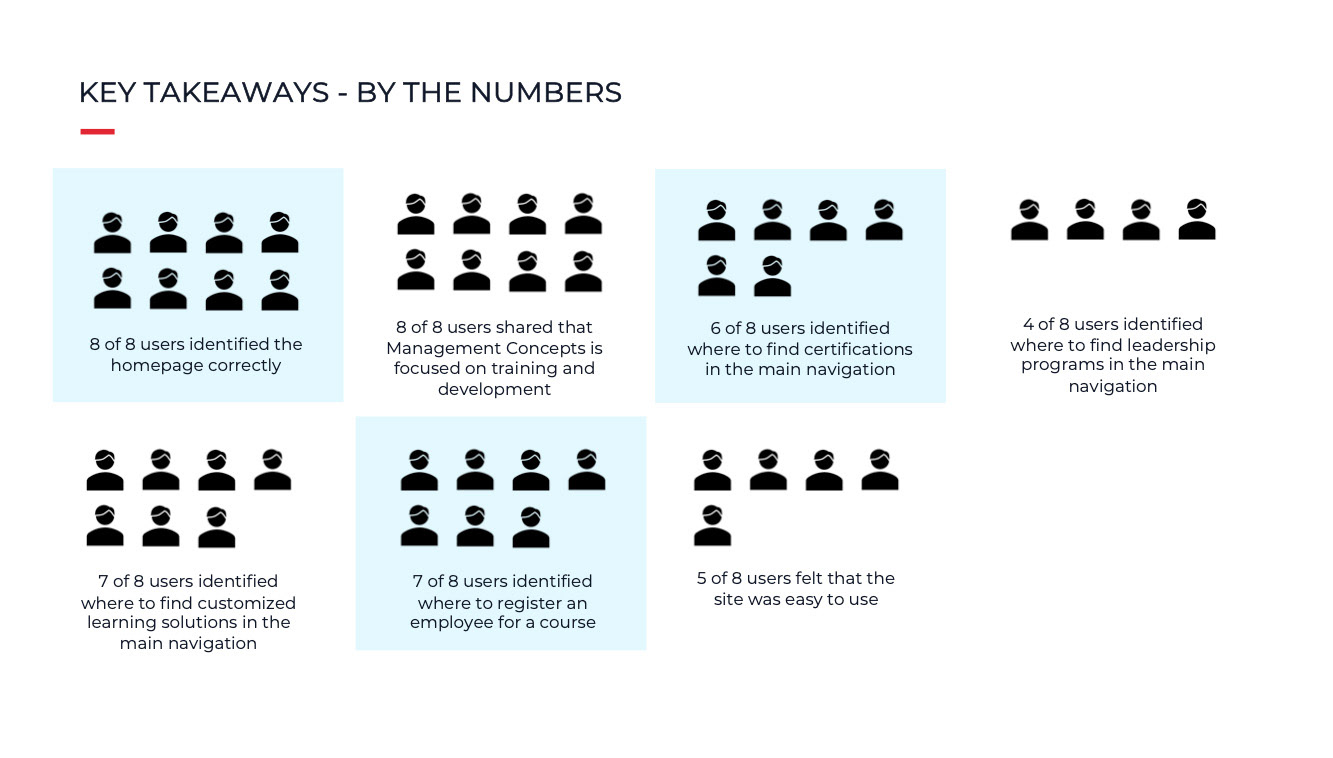
We conducted usability testing by facilitating one-click sessions with users. In these 30-minute sessions, we asked users open-ended questions about the items found on the homepage, around the nomenclature of the navigation, and tested a path to purchase. Setting up the usability testing in Optimal Workshop allowed us to easily track and extract the data from the sessions.
Ultimately we did learn from users that they felt the site was user-friendly and accessible, that the call to action was clear, and that the branding and design were cohesive. Areas of improvement focused heavily on the content of the site. This is an area that the client owned, so we were limited in our ability to make improvements but did take forth the findings to the client to continue to refine the language and content and provide users with a clear differentiation between offerings and the confusion around the nomenclature in the navigation.
UX Activities and Deliverables
• Prepared, facilitated and affinity mapped 4 stakeholder group interviews
• Identified and created 1 persona
• Created current state user journey map
• Information Architecture for the new site
• Created 30 mid-fidelity wireframes
• Conducted client design review sessions
• One-click testing with end users